Rubric is a North London property development in Whetstone, I worked on this project (strategy; design lead; copy) as a freelancer for London/Tel-Aviv based design firm CAPRI, under the expert creative direction of Josh Saunders.
Client
CAPRI
Category
Brand Design, Strategy, Copy
Delivered
2020
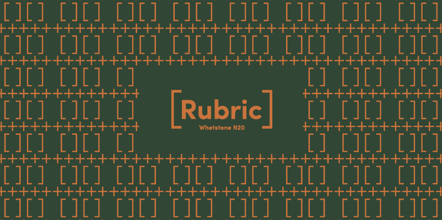
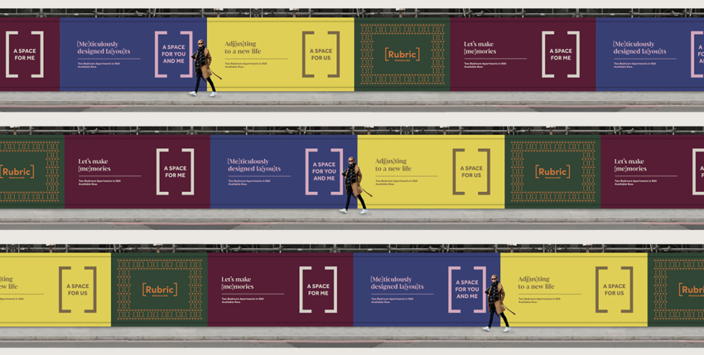
One of my main tasks on this project was naming – I came up with the name “Rubric” – it’s the word used often by South African teachers – it means the answer sheet to a test. It seemed like the perfect name for a development that was a little outside Central, offered all the bells and whistles – and a lovely community and village-vibe to boot. A smart move for young Londoners looking to own a place.
Pattern is the foundation of the design concept on Rubric. It is a typographic pattern of plus signs and square brackets inspired by the facade of the development.
Brackets
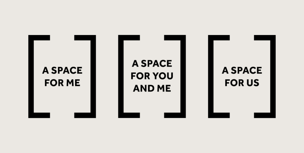
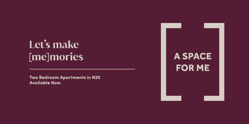
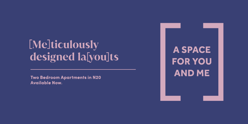
The design is copy and concept-driven. Using the parentheses as a holding device, a space, becomes a repeated motif throughout the identity – mirrored in the headline.
Colour
Using colour as an indexing system, the Rubrick primary brand colours remain consistent with each unit type consisting of its own grouping.