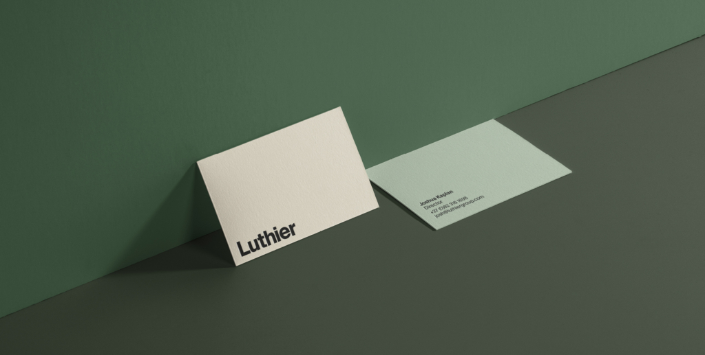
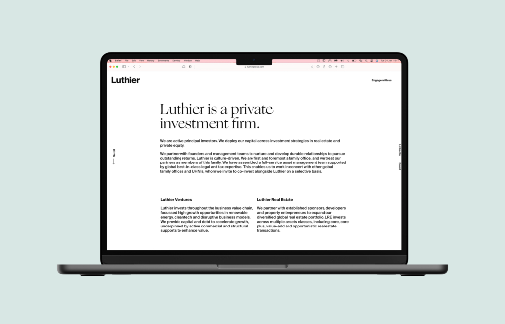
Luthier are active principal investors who deploy their capital across investment strategies in real estate and private equity.
Client
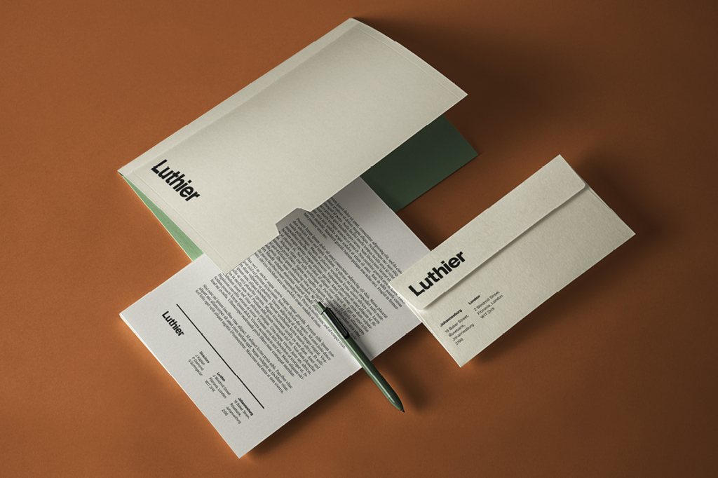
Luthier
Category
Brand Design, Web
Delivered
June 2021
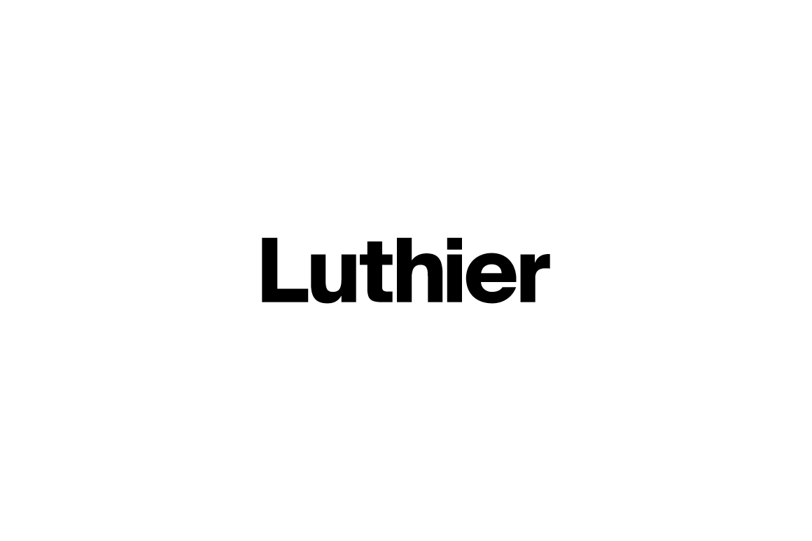
The International Style is form as function. This logotype is a celebration of the letter forms for their innate beauty and ability to communicate. Simplicity and function.
Colour concept
Logo mark
Colour
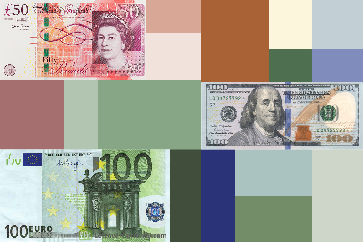
Toying with the idea of capital, value and investment, I sampled bank notes. The results were surprising; rich, luxe and strikingly quiet. Money talks, a lot of money whispers.
Mark
Tight optical kerning communicates an emphasis on relationships, and the use of typography alone is confident and strong. This is clean, masculine and sincere logotype that will never date.