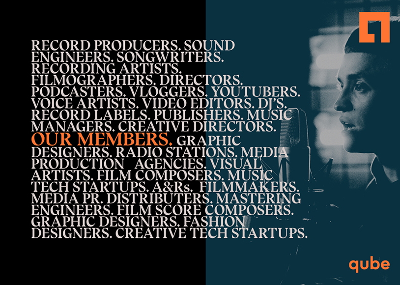
A hybrid space, Qube merges the meaning of a members’ club, the convenience of a co-working space and the magic of a creative studio. Creative yet technically specific, premium yet affordable this unique space required a passionate expression of its identity that matched the fullness of its potential.
Client
CAPRI, QUBE
Category
Brand Design, Strategy
Delivered
2019
Colour Concept
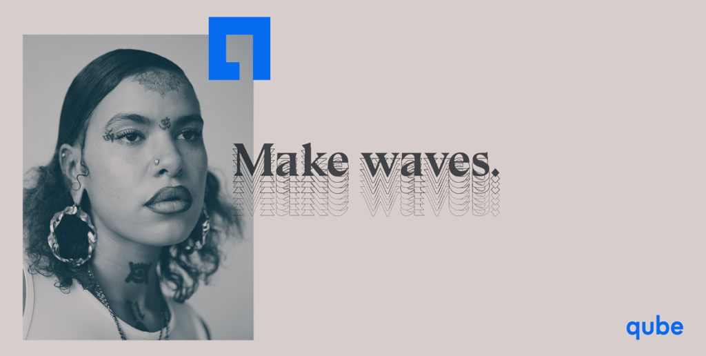
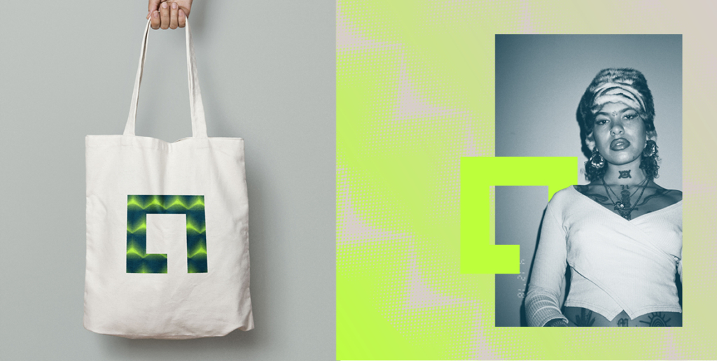
Using a broad palette with strict rules I created a system of interesting texture. Combining neutrals and intense brights. Duotone Duotone imagery using a neutral and white, or a gradient mask using one neutral and one neon. Type treatment on duotone photography is always in a neon and preferably over either black or asphalt duotone.
Gradients + Repetition
The design concept was rooted in the idea of synaesthesia – a phenomenon and occasional side-effect of hallucinogenics like LSD where individuals experience crossover senses. Like smelling colour, or seeing sound. This is not a new concept – Kandinsky famously painted music. This is a makers space, exploring the crossovers made sense.
Visual representation of the ways we seek to create harmonies with all senses – be it umami, balance an contrast on a page or iambic pentameter.